Key Takeaways
- Design for the screen, not the medium you’re repurposing: DOOH needs its own type, color, and word count rules.
- Match creative complexity to dwell time, from a single logo on a highway screen to full video in a transit hub.
- Test contrast and legibility at real-world distance and lighting before a campaign ever goes live.
Brands lose media budget every day by treating digital out-of-home screens like giant smartphones. A social graphic, a web banner, or a TV spot gets stretched across a premium screen. The result is washed-out color, hard-to-read type, and a wasted ad flight. DOOH design best practices exist to prevent that outcome. They translate brand messaging for the scale, brightness, and motion of a consumer moving through real streetscapes, not scrolling a feed.
Getting the details right, contrast, copy length, dwell time, and motion, is what separates a screen that gets noticed from one that gets ignored. This guide covers the DOOH design best practices that media buyers, creatives, and agencies rely on to build high-performing campaigns for premium urban and transit environments.
How Do DOOH Design Best Practices Differ From Standard Out-of-Home?
Digital out-of-home design has to work with three things at once: massive scale, bright screen light, and a moving audience. Print, TV, and even static billboards don’t face all three. That combination is why DOOH content needs its own rulebook, not a repurposed one.
A magazine ad gets viewed from fourteen inches away. A TV commercial gets watched from a couch. DOOH creative has to land instantly with someone walking past a screen or driving by it at speed. That means designers have to drop old print habits. They need to think in bright LED light, plan for sunlight glare, and design around the few seconds a viewer actually looks at the screen. Out-of-home marketing has always rewarded simple messages, but digital screens raise the stakes: every design choice gets amplified by brightness and motion. That’s precisely why DOOH design best practices exist in the first place.
How Do DOOH Design Best Practices Handle Copy Length?
Keep the primary copy to seven words or fewer. This limit, sometimes called the “Rule of Seven,” gives viewers enough time to read and absorb your message during the brief window they’re looking at the screen.
Word count is only half the job, though. Type has to hold up at a distance and in bright light. Thin, elegant serif fonts look great on a monitor, but they tend to disappear on an outdoor LED display. Bold, heavy sans-serif fonts read far better. Strong letter spacing, called “tracking,” keeps letters from bleeding into each other, a glow effect called “halation” that’s unique to lit-up screens. A clear visual hierarchy should point the eye to the most important element within three to five seconds. That’s roughly how long most viewers give a screen before moving on.
What DOOH Design Best Practices Apply to Color and Contrast?
Avoid pure white backgrounds. On a printed page, white space reads as clean. On an RGB LED screen, pure white acts like a floodlight. It causes glare and a halo effect that washes out any text placed near it, especially at dusk or after dark.
Push instead toward heavily saturated, high-contrast color pairs. Deep charcoal against stark yellow is a reliable combination. Pastel tones and soft gradients tend to vanish under direct sunlight. The Web Content Accessibility Guidelines (WCAG) offer contrast-ratio benchmarks that translate well to outdoor legibility, even though they were written for screens held at arm’s length rather than screens read from a city block away.
How Should Dwell Time Shape Your DOOH Design?
Design complexity should scale with how long a viewer actually looks at the screen, not with how much brand information you want to squeeze in. Pearl Media’s own portfolio, spanning storefront advertising, street corners, and transit hubs, shows just how differently these environments behave.
Short Dwell: Highway and Rapid Transit Screens
Strip creativity down to a recognizable logo, one high-contrast image, and nothing that requires reading. The goal is instant recognition for someone traveling at speed, not comprehension of a longer message.
Medium Dwell: Sidewalks and Street-Level Placements
Pedestrian spots, the kind of eye-level media found on busy street corners, allow for modest animation and a short, directive line of copy. Viewers are moving, but slowly enough to absorb one extra piece of information beyond the headline.
High Dwell: Transit Hubs and Waiting Areas
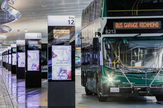
Captive audiences in transit hubs and other advertising venues can support longer videos, layered storytelling, and secondary calls to action, like a scannable QR code. This is where a brand can build a real story, not just a single impression.
When Should You Use Motion in DOOH Creative?
Motion earns attention, but how much you use depends on the screen’s location. Screens facing traffic are usually restricted from full-motion video since it can distract drivers. A subtle kinetic type or a slow background animation does the work instead.
Screens facing pedestrians have far more room to play. In captive, high-dwell spots, full cinematic video becomes genuinely valuable rather than excessive. It turns what would otherwise be one of many outdoor advertising products into an experience commuters actually stop to watch. Matching motion to the rules and habits of each location is one of the clearest signs of a mature DOOH strategy.
What Is Dynamic Creative Optimization in DOOH?
Dynamic Creative Optimization, or DCO, lets one digital screen pull in live data through simple API feeds instead of looping the same static file all day. It’s the feature that separates modern DOOH marketing from the flat billboard era.
In practice, that means creative can shift from a coffee message at 7 a.m. to a happy-hour message at 5 p.m. It can also update copy in real time based on weather, a sports score, or traffic conditions. Messages that reflect what’s happening around the viewer feel more relevant. And relevant messages are easier to remember than a generic one on a loop.
How Do You Test DOOH Designs Before Launch?
Test every asset at the size and distance it will actually be viewed before the campaign goes live, not after. A file that looks sharp on a laptop can fall apart at fifty feet.
Two checks are worth running on every asset. First, shrink the file down to business-card size and view it at arm’s length. That small scale approximates how the full-size screen reads from far away. Second, preview the design under bright daylight and again under evening LED contrast. A palette that holds up at noon can wash out, or glow oddly, after dark. Catching these issues in review is far cheaper than catching them mid-flight, which is why real-world testing belongs on every DOOH design best practices checklist.
Elevate Your Brand Environment With Pearl Media
Strong creative is only half the equation. The other half is the screen itself, and that’s where placement in Tier-1 markets matters just as much as design. Pearl Media built its business on premium street-level and storefront advertising, and that same standard carries through every digital screen in the portfolio today.
From eye-level corners to marquee transit hubs, Pearl Media’s locations are chosen to put well-designed creative in front of the audiences that matter most, including the kind of luxury consumer targeting that premium retail and hospitality brands depend on. Pairing expert DOOH design best practices with a portfolio like this is how a campaign moves from merely visible to genuinely memorable.
Ready to Put Your Brand on Premium Screens?
Great creativity deserves a screen that matches it. Pearl Media’s portfolio of street-level, venue, and large-format digital displays gives your next campaign the premium canvas it needs to stand out in the streetscapes your audience already moves through every day.